- Home
- School
- Brand Guide
Brand Guide
Brand Statement
The Spark of Inquiry
Question, Question, Question
In a world that constantly seeks answers, we dare to keep asking the right questions.
Our journey of redefining PolyU Design's brand began not with words, but with a visual cue - a bold new logo designed by a team of young alum, under the mentorship of an outstanding alum. This logo, with its striking feature of an invisible 'i' in the word Design, served as a powerful catalyst for our exploration into what truly defines us.
A Catalyst for Curiosity
The Invisible 'i'
The absence of the 'i' - a deliberate design choice - sparked a wave of curiosity among us. It challenged us to delve deeper, to question what this missing element represented. This visual provocation embodied our rallying cry: Question, Question, Question. It was a manifestation of the spirit of relentless inquiry we aim to instil in every student.
Core Ethos Uncovered
The Three I's
As we reflected on the logo's significance, we recognised that the invisible 'i' was not just about inquisitiveness. It symbolised broader principles essential to the future of design, principles that had always been at the core of our institution but had not been explicitly articulated. This realisation led us to identify five crucial facets, all captured by the letter 'i', that now form the foundation of our ethos:
Innovation: Design is humanity's heartbeat. Our creations marry imagination with utility, fusing entrepreneurial drive and sustainable practices to craft a future where innovation thrives in harmony with our planet.
Interdisciplinarity: Where disciplines unite, leaders are born. Our logo's boldness isn't just a mark; it’s a call for design students to take the wheel in innovation.
Inclusiveness: Design with everyone in mind, benefit all. Our creations are universal, speaking to diverse needs and experiences. Our canvas is the world, enriched by the vast spectrum of humanity.
The Journey Continues
Evolving With Every Question
For over six decades, these principles have fuelled PolyU Design’s pioneering impact. Our integrated curriculum acts as a catalyst, teaching students to not just uncover solutions but to frame the paradigm-shifting questions that unlock the future.
We push beyond pat answers, fostering diversity of thought to enrich the creative process. The result? An acclaimed lineage of design leaders with the visionary foresight to drive change.
Our new brand mark, with its invisible 'i', encapsulates this ethos. It symbolizes the tireless curiosity propelling our evolution, while the bold font exudes confidence in a future guided by our Three I’s and our commitment to advancing design through boundless inquisitiveness.
This journey from a visually provocative logo to the articulation of our Three I's exemplifies the very essence of what we advocate at PolyU Design. It underscores our perseverance to questioning, exploring, and evolving - ensuring that our students are equipped to lead and innovate in the ever-changing landscape of design.
Logos & Extensions
Igniting Curiosity with a Strong Brand Identity
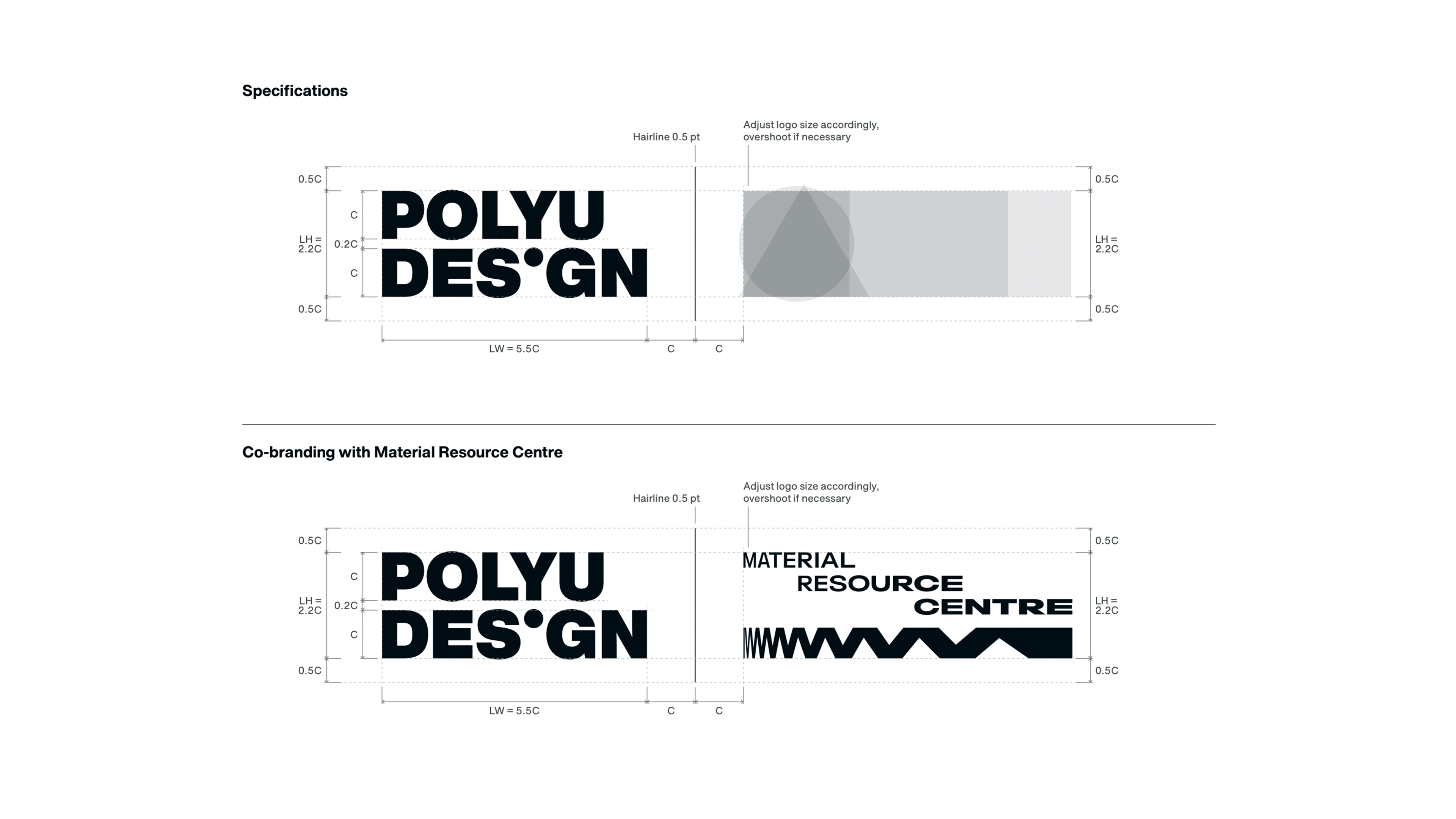
The logo
The PolyU Design logo is a powerful embodiment of its brand ethos, “Question, Question, Question”. It makes use of the invisible “i” design element to symbolise the curiosity that drives exploration and discovery in every aspect of life.
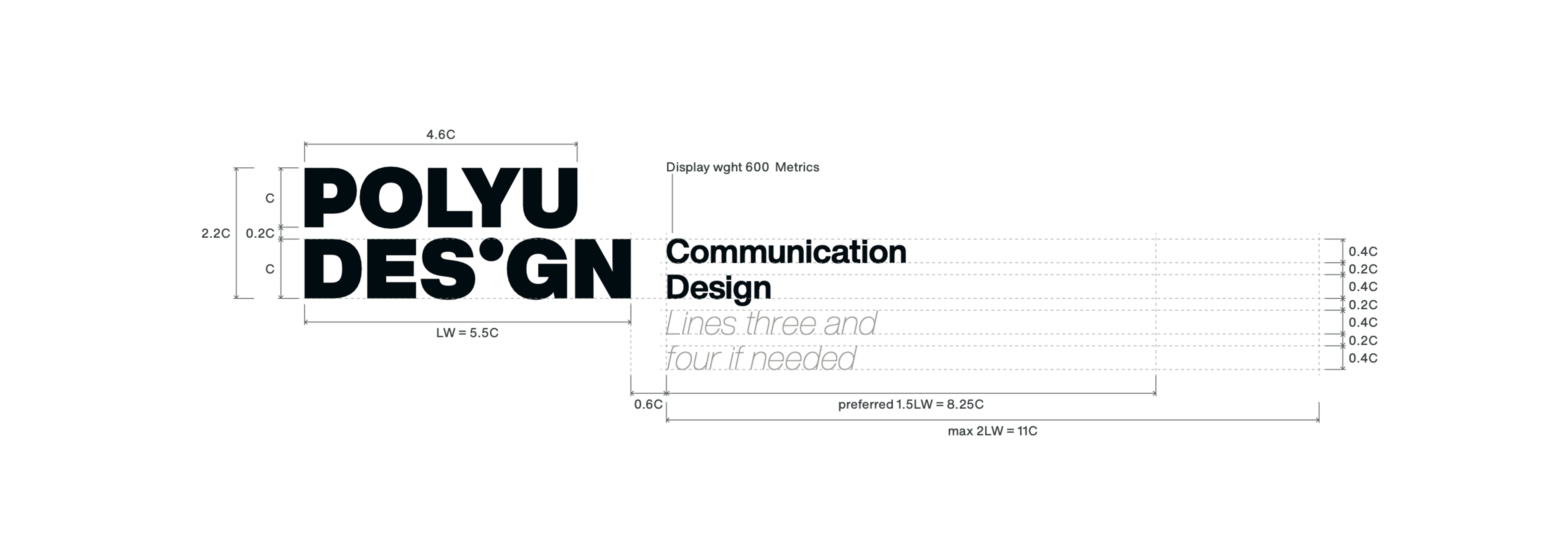
The two-line wordmark. This versatility allows the logo to adapt to different contexts while maintaining its visual identity and brand message.

Colours
Colours give a unique personality to the brand while providing flexibility to cater to different usage scenarios.
Black and white compose the confidence of us being a world-class design educator with a long history that has nurtured numerous curious designers. The monochromatic palette offers a timeless impression.

A secondary color scheme is available to provide flexibility for different scenarios, with colors selected from a palette centered around the 325C Pantone color, which we have frequently used for years.

Typography
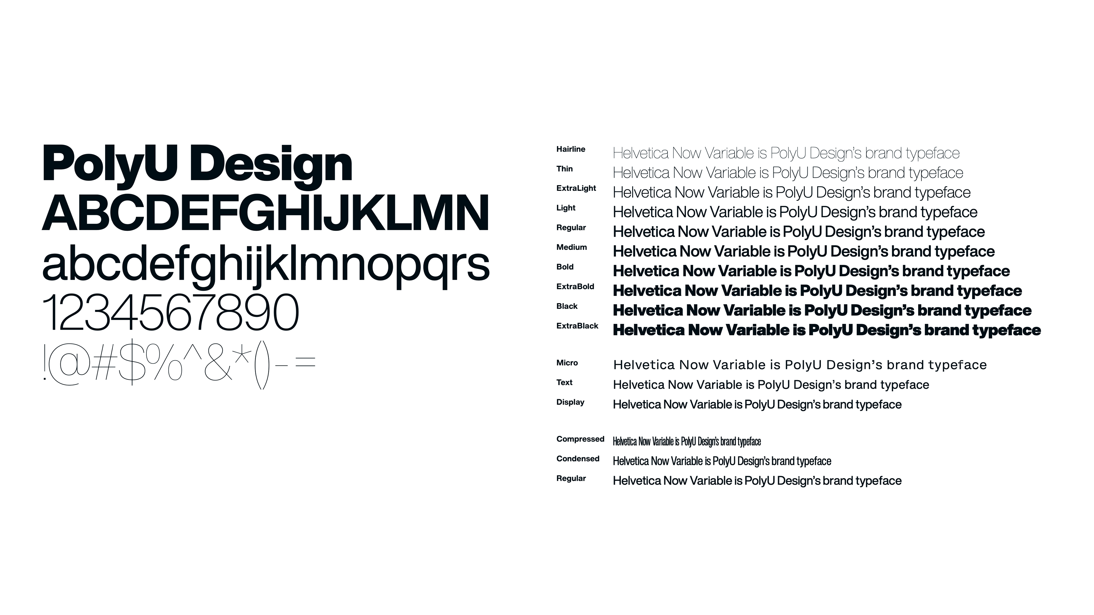
PolyU Design takes pride in its branding elements, including the carefully selected typefaces for different communication needs.
Helvetica Now Variable is PolyU Design's brand typeface. It is a variable font that includes two styles (Roman and Italic) and three axes (weight, width, and optical size). The use of Helvetica Now Variable adds a touch of timelessness and consistency to our English materials, reflecting our commitment to quality design.
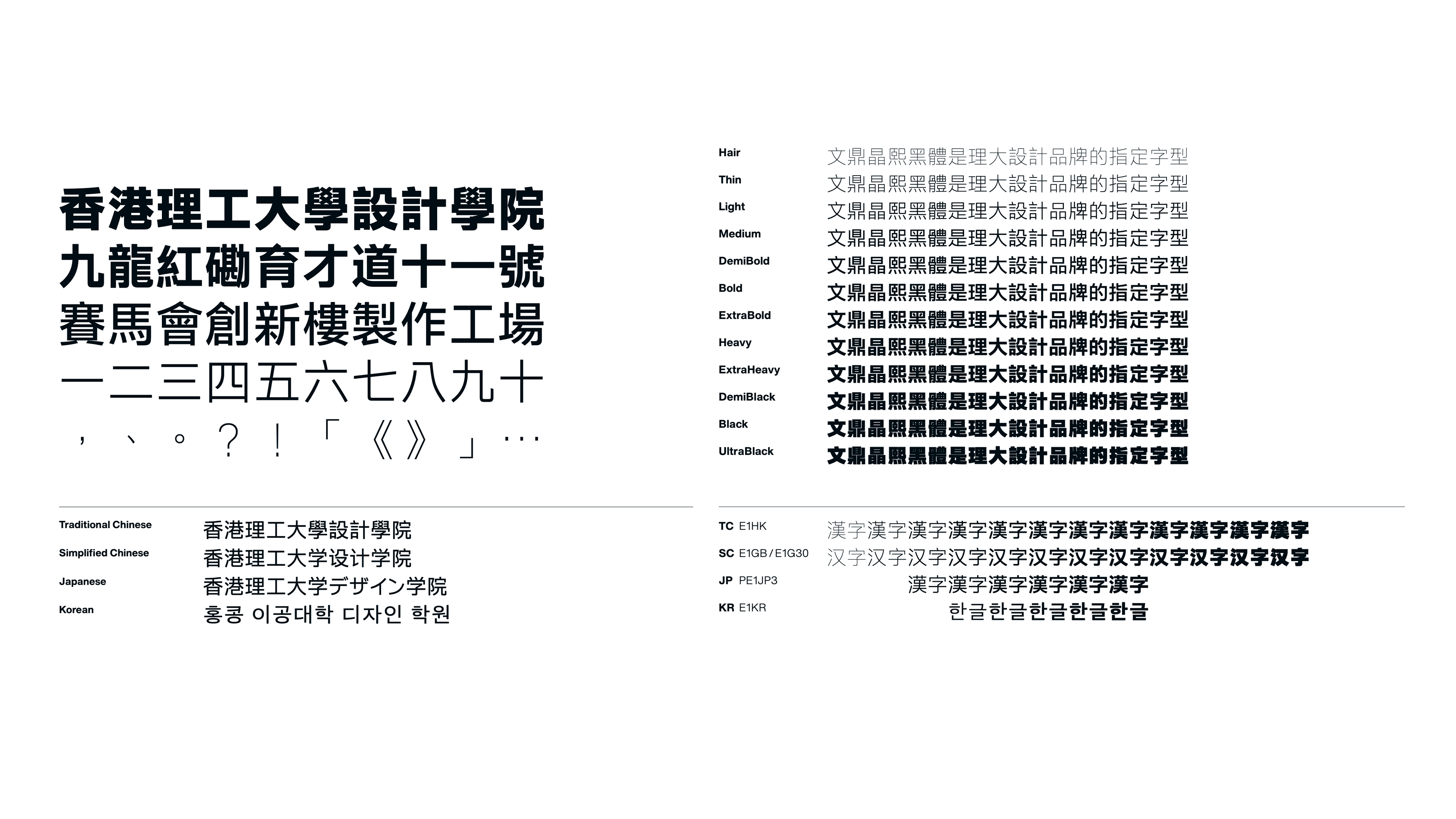
AR UD JingXiHei is PolyU Design's brand East Asian typeface, used for our Chinese communications. It is an East Asian font family that covers languages including Traditional and Simplified Chinese characters, Japanese Kana and Kanji, and Korean Hangul. By utilizing AR UD JingXiHei, we ensure that our Chinese communications are accurately and consistently represented, resonating with our targeted audience while maintaining a cohesive brand identity.
Sonic Branding
Sonic branding creates customised soundscapes for virtual environments, using music and sound effects tailored to a brand's messaging and identity. Through this distinctive sonic identity, the PolyU Design's brand presents a vivid vibe enticing and engaging recipients, while capturing their interest and arousing curiosity.
Credits
The Symbolic Collaboration of Heritage and Innovation
The new identity’s launch marks a significant milestone for this renowned institution. Led by brand expert Mr Tommy Li, a team of young designers embarked on redefining PolyU Design's identity.
The new identity symbolises a new chapter in PolyU Design's history, inspiring the next generation of designers. The collaboration between Mr Li and the young designers serves as a symbol of heritage and mentorship.
The Design Team
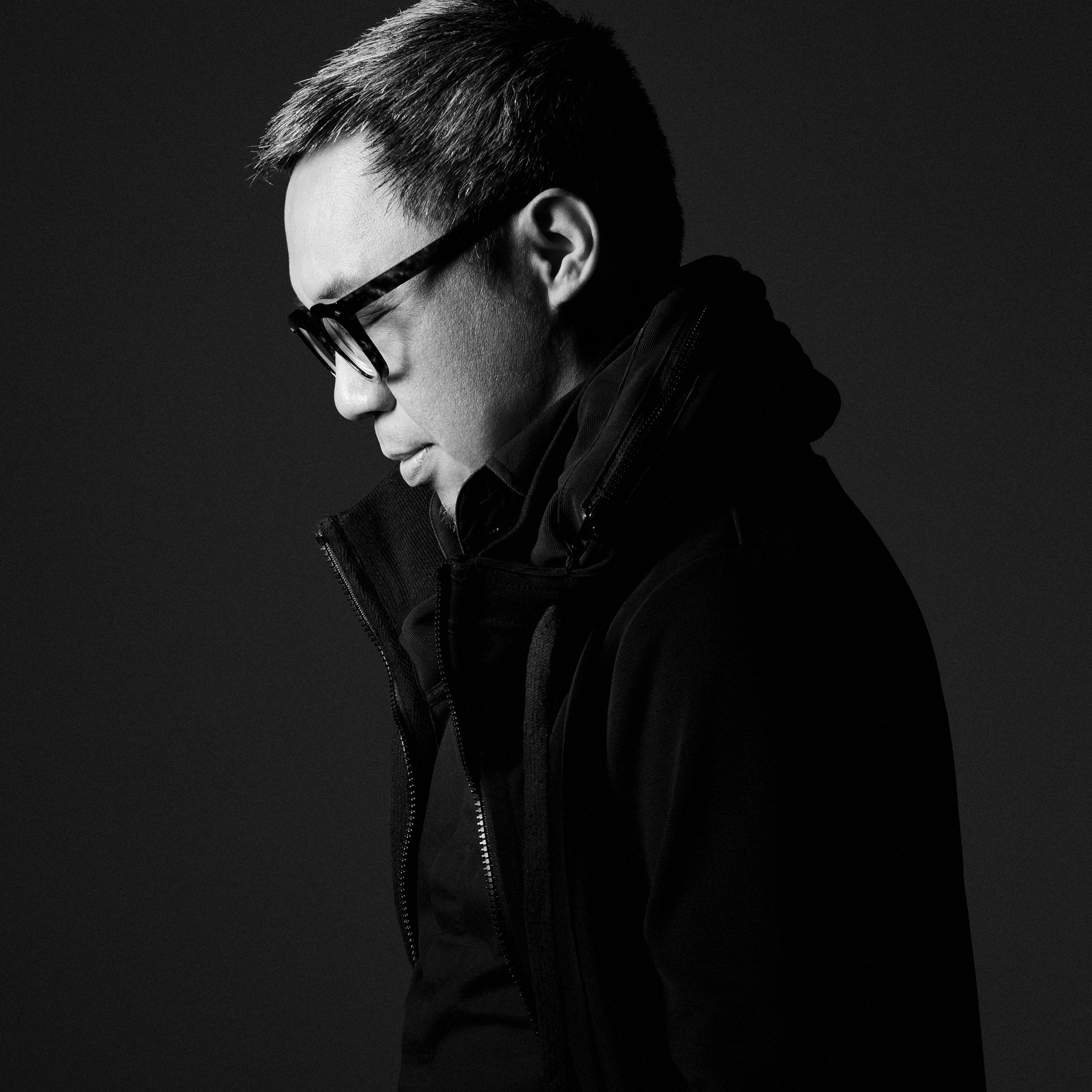 |
Tommy Li Tommy Li is a renowned brand designer from Hong Kong, known for his unique design style and innovative thinking. He has made a significant impact on the international market, with his work spanning across Hong Kong, China, Japan, and Italy. Tommy Li's unique design style and innovative approach have earned him a well-deserved place among the industry's elite, both locally and internationally. Tommy received over 700 awards and served as a judge in numerous international competitions, including Young Gun, iF Design, D&AD Award, Global Design Award, and more. Tommy has been a member of AGI since 2005. He had solo exhibitions in Hong Kong and cities such as Chengdu, Suzhou, Beijing and Shenzhen during 2010 to 2018. His book "Rebranding X Consumption Jungle" is a China's bestseller as a brand design textbook. He helped his clients to gain remarkable success. These clients include Hang Seng Bank, MTR Corporation, Maxim's Caterers, Chow Sang Sang and many more.
|
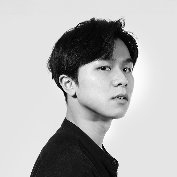 |
Jeff Kit Fu Chan Jeff is Creative Partner at Neighbour Co. whose work has been recognised by local and international awards. Among his notable achievements are the Gold Pin Design Award, GRAPHIS Young Talent Awards (Silver), Hong Kong Kam Fan Awards (Gold & Bronze), Hong Kong 4As Students' Awards (Silver) and more.
|
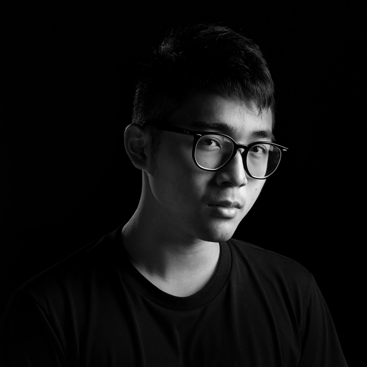 |
Chi Ho Cheung BA(Hons) in Advertising Design (2022) Graduated with a First-Class Honours in Advertising Design, Chi Ho is now the brand designer and creative partner at Neighbour Co. Recognised as a young talent by the industry, Chi Ho’s works has been awarded at the British D&AD New Blood awards (Wood Pencil), Young Stars of Korea MAD Stars (Silver & Bronze), Hong Kong 4As Students’ Awards (Best of Show, Gold & Silver) and more. |
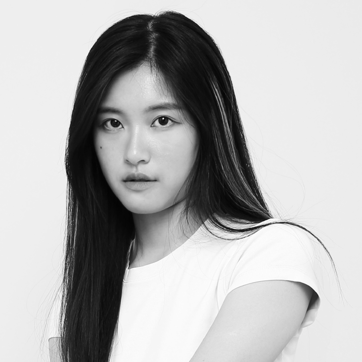 |
Eunis Yue Ting Liu BA(Hons) in Communication Design (2022) Eunis is a versatile designer whose interests encompass branding, graphic design, printing, and digital fashion. She is passionate about incorporating strong concepts and thoughtful design thinking into her works, ensuring that her creations are not only visually appealing but also meaningful. Eunis was honoured with the Red Dot Award for Brands & Communication Design in 2022, that serves as a testament to her exceptional skills and innovative approach to design. |
 |
Thomas Ho Man Ng Thomas works both as a type designer and a brand designer. His works include Prison Gothic, Metro Sung, Stencil Heiti (working title), and brand design and management works for large properties and hospitality brands. His works were recognised by major awards including the Monocle Design Awards 2023 Best in Type, HK4As Students’ Award 2020 Silver Award, etc. |
Media Production Team
Ken Cheng, Hong Lam, Tiyan Lau, Howard Lui, Zac Wong, Jensen Yip, Rafa Yu
Other Contributors
Initiator: Prof. Kun-pyo Lee
Brand Narrative: Rennie Kan
Facilitators: KC Tsang, Man To Yiu, Anita Law, Jason Liu
Researchers: Phoebe Wong, Lok Tung Chan
Downloads
For PolyU Design staff, please use NetID to log in here.
For PolyU Design students, please write to sdmktg@polyu.edu.hk.