We investigate what makes information accessible, understandable, usable and attractive
The Information Design Lab (IDL) is a research and consultancy unit at the School of Design, Hong Kong Polytechnic University dedicated to investigating what makes the design of information accessible and easy to understand. The IDL’s primary focus is on the processes influencing how people recognise, make sense of, process, remember and learn various types of information. We adopt user-centered research methods to ensure that solutions are accessible, usable, understandable, as well as attractive for the intended users. The research spans across all media, types of users and contexts of use.
The IDL aims to develop information design as a distinct field of scholarship and practice, and to advocate for the value of information design in Hong Kong and beyond. The lab actively explores new possibilities for the design of effective information, and generates new knowledge through the development of theories, models, processes and methodologies. IDL also conducts practice-led research and actively engages in knowledge transfer.
Aims:
- To develop information design as a distinct field of scholarship;
- To function as a think tank for issues related to information design;
- To advocate for the value of information design in Hong Kong; and
- To foster a research culture on the topic of information design within the School and to provide a platform for collaboration and exchange amongst faculty members.
Objectives:
- To investigate what makes the design of information usable and effective for a diversity of users, contexts and media through applied research and consultancy;
- To explore new possibilities for the design of information;
- To generate new knowledge on information design through the development of theories, models, processes and methodologies;
- To disseminate knowledge and research findings on information design to relevant stakeholders and to establish connections with the design industry and the public; and
- To bridge research and the learning and teaching of information design through educational initiatives, particularly in the form of work-integrated education
Research interests:
- Vernacular Visual Culture in Hong Kong
- Wayfinding systems and signage design
- Chinese calligraphy and typography
- Data visualisation
- Multilingual and multiscript typography
- Form and document design
- Print and digital publishing
- Interface design
- Clear language
Award:
Ministry of Education’s Higher Education Outstanding Scientific Research Output Award
Location: V512, 5/F, JCIT
From Legible London to Hong Kong: Localising and Enhancing Accessibility and Legibility in Pedestrian Wayfinding through User-Centered Design
This project focuses on the design and evaluation of a Pedestrian Wayfinding Signage System in Hong Kong, taking inspiration from the internationally acclaimed Legible London's wayfinding system. Legible London, introduced in 2007 and operated by Transport for London, has received numerous design awards for its success in creating accessible and walkable cities.
However, when the Transport Department in Hong Kong adopted the Legible London principles, challenges emerged due to the lack of proper localisation. One significant challenge was presenting information in both Chinese and English languages, considering Hong Kong's bilingual status. This led to reduced usability and difficulties in accessing information within the wayfinding system.
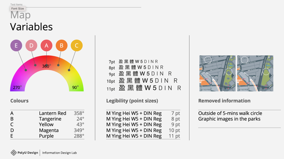
To overcome these challenges, the project conducted user tests, focusing on three crucial variables: legibility, color usage, and information relevancy on the map. The research team collaborated closely with the Transport Department to identify and prioritise these variables, considering the unique needs of Hong Kong as a bilingual international city.
Ten participants, comprising both local and non-local individuals aged 18 to 50+, participated in three rounds of user tests. The study evaluated legibility by testing Chinese font sizes ranging from 9 to 11 points and explored the optimal amount of information to be included in different sections of the totem.
Based on the findings, the project provided design recommendations to enhance localisation, improve legibility, optimize color usage, and enhance information hierarchy within the Pedestrian Wayfinding Signage System. By incorporating insights from the localisation challenges faced and drawing upon the success of the Legible London project, this user-centered design approach aims to contribute to the development of a more effective and user-friendly wayfinding system in the complex urban environment of Hong Kong.
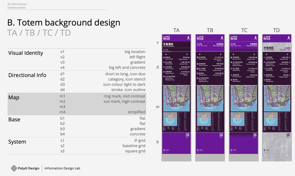
Various designs of totems and information organisation were presented on the right for user testing purposes.
The user tests focused on three key variables: colours, Chinese font sizes, and information relevancy.
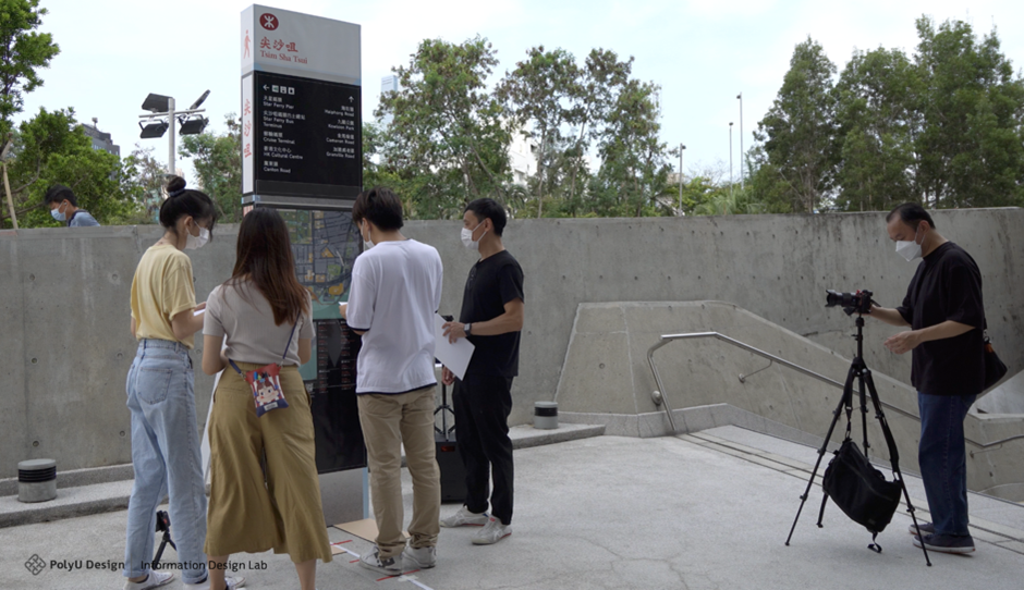
Ten participants were recruited to identify problems in various prototypes of totems. Searching tasks were conducted for each prototype, followed by follow-up questions after the user tests.

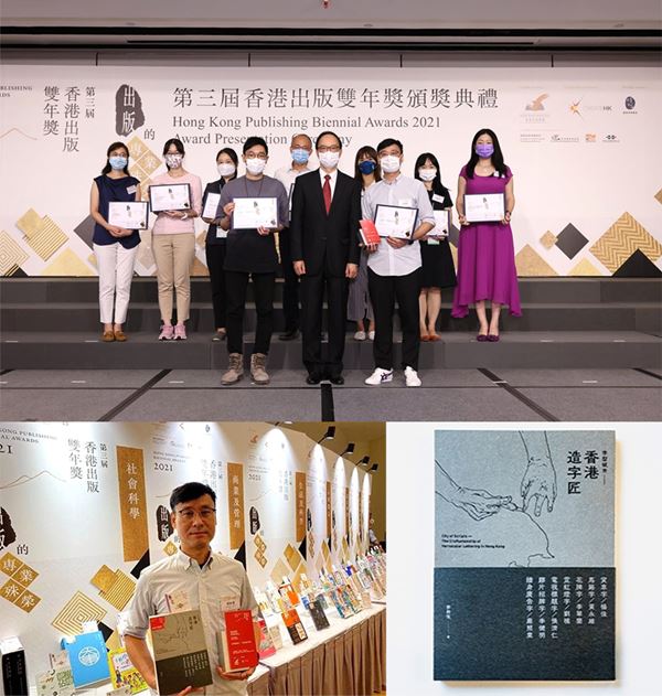
The Craftsmanship of Vernacular lettering in Hong Kong
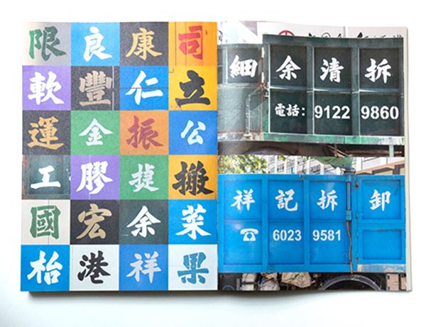
Hong Kong is a place filled with all kinds of type and lettering. They are the elements that strengthen our bond as a community, enrich our imagination towards places and construct the characters of our neighbourhood. There is a saying in Chinese: ‘Seeing one’s writing is like seeing them in person’. It can also reflect the details and cultivations of our city’s way of life.
In this regard, our research team from Information Design Lab visited our fellow craftsmen to learn about their experience and their lives working with vernacular lettering. Each of their craftsmanship has its own unique features, functions and different pursuits of aesthetics. Consider taking a closer look at them – the untold stories and thoughts shall be revealed behind the characters and figures of these humble craftsmen.
Through this book, we wish to provide more possibilities in understanding our city to those who are interested in lettering and type design as well as street culture.
Award
The Best of the Best award of the Social Science category at the Hong Kong Publishing Biennial Award 2021
A website of Hong Kong neon sign database 香港霓虹資料庫
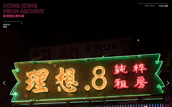
Our continuous documentation of neon signs in Hong Kong since 2015 has accumulated into a small database of over 500 photos, featuring existed and existing neon signs from various perspectives, day and night. The diminishing of neon signs in recent years has caught our attention to the urgency in encouraging discussions and recognition of Hong Kong’s neon sign visual culture.
The ‘Hong Kong Neon Archive 香港霓虹資料庫’ website aims to introduce our database to the public’s access and is designated for research and educational purposes, especially in design and cultural perspectives.
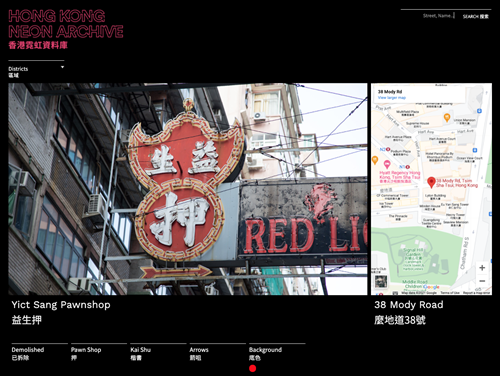
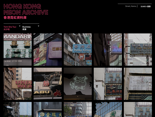
Hong Kong Neon Archive 香港霓虹資料庫>>
An innovative health communication design enhancing the medication administration experience of the elderly
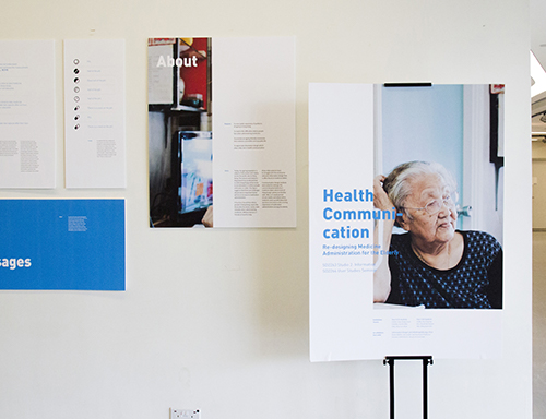
Today, the aging population is the subject of discussion and inquiry across the world, also in Hong Kong. The Census and Statistics Department has predicted that, in 2039, Hong Kong will be home to an estimated 2.5 million people of 65 years or older. This figure suggests that there are challenges ahead and an important factor will be an increase in medication administration.
It has been found that elderly people in Hong Kong, especially those who live alone, easily make mistakes when administering medicines. Without doctors or friends on hand to help, these older patients have to struggle with the small print and poor information design that is often found on medicine labels.
The project studies the current Hospital Authority’s medicine labels, which most of Hong Kong’s elderly are familiar with, in terms of their typographic design, physical form and administration methods. Through user studies and observation, ideas that question and improve the existing experience of medication administration among the elderly experimented with design prototypes and rounds of user testing.
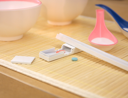
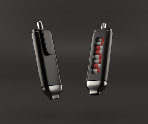
Readyset is designed by a group of Year 3 Communication Design students to facilitate better medication administration and experience for the elderly. The pen shape design is highly portable, as well as very versatile for storing and stacking circular tablets while not wasting space like any rectangular shape. It is a good idea to integrate the pen mechanism into taking drugs as well.
With its emphasis on convenience and portability, the design title comes from the phrase “Ready, Set, Go!” in sports events by which the designers hope to connect the products to the consumers with the ready-to-go feature.
The design of Readyset is attempted to achieve the following features:
1. Hygiene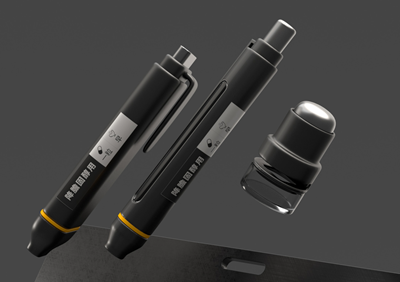
In order to achieve the goal of hygienic drug taking action, the team have developed the pen-like mechanism - Readyset, allowing the elderly does not need to have direct contact of the flesh with the pills. The Readyset can eliminate the chance of contaminating the pills with bare hands, as well as allowing the elderly to take the medication easily on the go.
2. Organiser
Readyset is designed to unify different pills into one single column, allowing the elderly to organize medication easily and reducing the required storage space in a household environment. The label attached on the pen-like device extract the most considering information based on the result that the team collected from the user tests.
3. Customizable
Readyset provides various materials and colorways for the elderly to choose based on their preference, to create a personalized drug-taking experience. Also for the identification ring on the pen, the customizable feature, on one hand, allow customers to choose the color they like, as well as allowing them to differentiate their pen within a household area.
4. Portable
The lightweight and small-size design aim to provide a better drug-taking experience when the elderly is commuting. The design allows them to ease with all procedures required in traditional medication.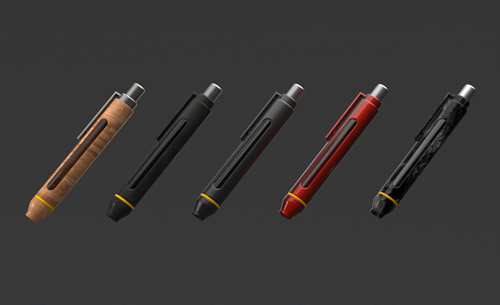
Award
Bronze ADC Cube Award 2019Readyset won a Bronze ADC Cube Award which the design ceremony held and announced by The One Club for Creativity, an international design competition, in New York in early May.

Project Team
Designers: Lok Ngai Lego Lam, Ping Ting Lee, Man Yin Chan and Rachel Yin (Year 3 Communication Design students)
Tutor: Brian Kwok