
You probably are used to seeing plots with error bars on them; here's a recent example (-slash-shameless-plug) from a recent paper of ours. But do you know what they mean?
No matter how good at stats you are, you often can't tell what error bars mean. Unfortunately, people use error bars to illustrate many different things, and even more unfortunately, oftentimes they do not indicate what the error bars actually are. The best thing to plot with error bars is confidence intervals (see, e.g., Cumming & Finch, 2005), but people often use them to plot other things, such as ±2 standard errors (a rough approximation, sometimes, of a 95% confidence interval), one standard error, or even one standard deviation. This is problematic because people looking at a plot usually try to make statistical inferences based on the error bars (e.g., "The error bar for this condition doesn't cross the mean for that condition, so the difference is significant!"), but these inferences are only licensed for certain kinds of error bars; an inference based on how a 95% confidence interval works (e.g., "The bottom of the error bar for this condition only just barely touches the top of the error bar for that condition, therefore p≈.01") would be invalid if you're actually looking at error bars showing 1 standard error (a much narrower range than a 95% confidence interval). Furthermore, the fact that error bars can mean so many different things often causes researchers confusion about their own results: I often hear people asking questions along the lines of "Why do my stats come out significant but my error bars cross?", or vice versa. Therefore, it's important to know what the different kinds of error bars are, and to know which kind to use on any given plot. Not only does this help you present your data more honestly, but it also can help you be more confident about results that you're seeing.
In this essay, I will assume that we all accept that error bars should show [95%] confidence intervals (CIs) and that we should indicate this in our figure captions;1 if you are not yet convinced of that, do check out Cumming & Finch (2005), linked above. What I will discuss here is a tougher issue: that of how to plot error bars for a within-subjects design. As you probably know, the formula for the confidence interval of a parameter estimate (like a sample mean) is Mean ± (SD / sqrt(N) * tcritical): i.e., if you have a mean based on 24 participants, you take the standard deviation of the 24 participants' means, divide by the square root of 24, and multiply by what the critical t-value would be for a t-test on this mean (as N gets higher and higher, this critical t-value for α=.05 approaches 1.96) and finally you add and subtract this value from the sample mean. As we will see below, however, this standard CI formula is not always appropriate. In particular, for a plot of different within-subjects conditions, CIs based on this formula will lead you astray. Nonetheless, in psycholinguistics we are usually interested in within-subject comparisons, and therefore once we all agree to plot CIs instead of standard errors or something else, we run into a new challenge, the challenge of how to plot meaningful error bars for within-subject comparisons. Below we'll discuss why this matters, and how to solve the problem using Cousineau (or Cousineau-Morey) CIs.
Loftus & Masson (1994) explain and illustrate why it's a problem to use typical between-subjects CIs in a plot showing within-subjects manipulations. This is highly recommended reading, but to make a long story short, trying to make inferences about within-subjects effects based on a between-subject CI in a graph is often misleading, because a typical between-subjects CI only shows the variation between subjects within a given condition, whereas you are interested in making paired comparisons with another condition. To put that another way: a typical between-subjects CI provides a rough estimate of where that condition's mean might really be in the population.2 However, for a within-subjects experiment, we typically don't care about the population mean for each condition; we only care about the population mean of the difference between two (or more) conditions. For example, in a semantic priming study where we compare people's response times when they have to read aloud target words (like doctor) preceded by associatively-related primes (nurse) or by unrelated primes (table), we generally do not care about estimating the population mean of the response time for primed words and that of the response time for un-primed words; we only care about finding the unprimed-primed difference, for each subject, and using those differences to estimate the population mean of the difference. (And then, usually, all we care about is whether or not that population mean might be zero; if our CI suggests that the difference is not likely to be zero, we call it "statistically significant" and celebrate, while the real statisticians weep and gnash their teeth as they behold our over-reliance on statistical significance.)

The solution Cumming & Finch (2005) recommend for this problem is to plot, instead of or in addition to the condition means, the difference of interest, along with its CI. The CI for the difference can be computed as a normal between-subject CI, using the familiar CI formula, since we are interested in how much this difference varies between subjects. To the right is an example (Figure 3b from Cumming & Finch, 2005) illustrating this. The two dots represent condition means and their between-subjects CIs, while the triangle, which is on its own scale off to the right, represents the mean of the paired difference, and the CI of that mean difference.
Let's create a plot like this using some real psycholinguistic data, as a starting point for playing around with different kinds of CIs. The data are from Politzer-Ahles and Fiorentino (2013) and can be downloaded from there. The R code for recreating the plots is available at the bottom of this post (also note that, while I'm using R here, everything I'm describing can also be done in Excel or whatever your preferred software is). Without going into too much detail about the experiment, I'll just say this this was an experiment where we looked at how quickly people read a critical part of a sentence, as a function of two factors about the preceding context: whether one of the preceding sentences used the quantifier some or only some (this factor we called Quantifier) and whether another preceding sentence used the quantifier any or all (this factor we called Boundedness). We were interested in the simple effect of Boundedness at each level of Quantifier; for theoretical reasons that I of course find interesting but that are irrelevant here, we predicted a significant effect of Boundedness in the some stimuli (such that reading times would be slower after any than after all) and no comparable effect in the only some stimuli. Here's how the results look, in a plot3 somewhat following Cumming & Finch's suggestion, with separate dots for each simple difference (on their own axis, which is on the right), and with p-values (from paired t-tests4) added so we can tell if the confidence intervals are a reasonable reflection of the significance level:
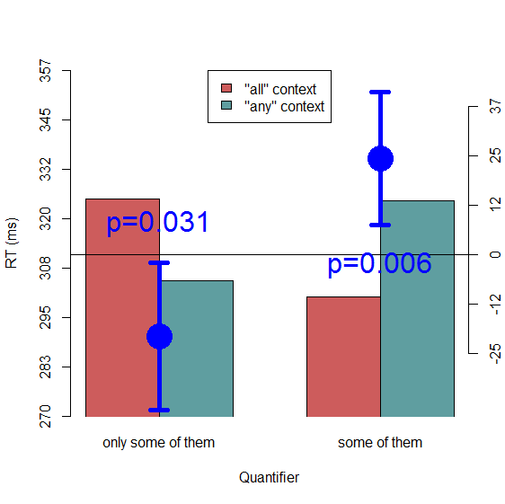
We see here that the between-subject CIs of the differences (calculated using the familiar between-subjects CI formula: SD / sqrt(N) * tcritical) look reasonable: both simple effects are significant at a=.05, and both error bars fail to cross zero. So everything is as it should be. (Of course, if we were using this plot in a paper, we should also have given it a descriptive caption that explains what the differences represent—i.e., which condition was subtracted from which—and what the error bars represent.) Let's see how things would look if we had used this same CI formula to add CIs to the condition means themselves:
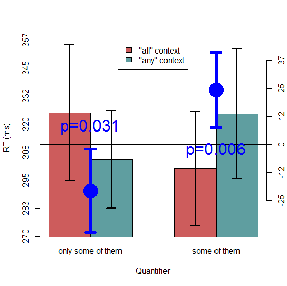
Suddenly we have nonsense! If we looked at this plot with only the bars and between-subject CIs on the bars, without the difference CIs and p-values, we would have incorrectly concluded that there are no significant simple effects here. Hopefully this, along with the similar examples in Loftus and Masson (1994), convinces everyone that plotting a between-subjects CI on each bar is misleading if you are interested in making inferences about within-subject differences.
Above we already saw one solution to the problem of plotting CIs for within-subject comparisons: you can plot a difference and its CI, rather than (or in addition to) plotting the individual condition means. This is fine and straightforward when you only have two conditions to compare. But it can quickly get out of hand, as Cumming and Finch (2005) also note. In the above plot we showed two differences rather than one, and the plot is already getting clunky, and that's without even plotting two more simple effects that we could have plotted (the effects of Quantifier at each level of Boundedness), plus the two main effects, plus the interaction. All of those could, in theory, have been plotted in the same way as we plotted the two simple effects of interest. The problem gets even more complicated for a factor with more than two levels, where there are multiple possible pairwise comparisons that could be plotted. Imagine how badly the problem scales for a 2x2x4 design (e.g., in Politzer-Ahles & Zhang, in press). It becomes unfeasible to show all possible pairwise differences on a plot.
Of course, you can strategically plot just the pairwise differences that are relevant to your hypothesis, like we did in our sample plots above. But it would be ideal to plot the data in such a way that a reader interested in other comparisons that you haven't considered can still make those comparisons. (Hopefully you also make your data available so readers can pursue these comparisons; however, it would be ideal to make this information available at a glance in the plot, and in some contexts, like a conference talk, you usually can't give the data to the audience.) What would be ideal is an error bar that can be put on an individual condition mean to help people make inferences about the difference between that mean and any other condition they want to look at. Fortunately, within-subject confidence intervals have been developed and can serve roughly this purpose.
What we want in a within-subject CI is for it to license the same kinds of inferences as a between-subject CI does. Lucky for us, Cumming & Finch (2005) provide guidelines for what kind of inferences can be made based on visual inspection of a pair of between-subjects CIs. Check their paper for the detailed guidelines; here's a quick summary:
Now we just need to test out within-subject CIs to see if they conform to these expectations for our sample data, where we already know that one difference is at p≈.031 and the other at p≈.006.
The first kind of within-subject CI is that proposed by Loftus & Masson (1994), which is based on terms from the repeated-measures ANOVA table. I don't use this one, for a few reasons. First of all, for a stats dummy like me, it's a pain to calculate. Secondly, it calculates equal-sized CIs for each condition, whereas I generally want a unique CI for each condition, since sometimes one condition has more variance than another. Finally, and most importantly, the size of the CIs depends on the comparison you want to make: you need to make different CIs for looking at a certain main effect versus another main effect versus a certain interaction, etc. Of course, there is a reason for this: the test statistics for different effects are indeed different. However, this leaves us at the same quandary we discussed above for complex datasets, and thus I would prefer a kind of CI that allows for testing just about any pairwise comparison (at the expense of main effects and interactions; those I usually discuss in the text and don't worry about directly illustrating in a plot).
Cousineau (2005) describes another method of calculating within-subject CIs which addresses all these problems. It is simple, it allows a unique CI for each condition, and it is not dependent on the comparisons tested. (In fact, Loftus & Masson, 1994, also describe such a method in their appendix, but I find this method easier so it's what I use.) This method turns out to be slightly biased: it gives slightly smaller CIs than the Loftus & Masson method. Morey (2008) updated the formula for these CIs to correct for the bias, so nowadays CIs derived by this [updated] method are known as "Cousineau-Morey CIs".
I won't go into detail on how Cousineau-Morey CIs are calculated; the formula is actually quite simple, both papers are very accessible and easy to read, and there are some nice tutorials online (here is a very clear one; plus, my R code below includes a [hopefully] handy function to compute these CIs automatically; implementations can also be found in, e.g., Baguley, 2012, and Cousineau & O'Brien, 2014). Let's forge ahead and test out these CIs to see if they match up to the inference criteria that we want. Here's a new plot, with 95% Cousineau-Morey CIs, rather than standard between-subject CIs, shown on each bar. As usual, the code is available at the end of this post.

Things look much better now. On the left-hand side, where we know p≈.031, the bars do indeed appear to overlap by about half (i.e., one bar reaches about halfway up the other bar, and vice versa). And on the right-hand side, where we know p≈.006, the lines only just barely cross. This comes close to the criteria outlined in Cumming & Finch (2005), although in both cases the p-value I might guess from visual inspection is probably a bit higher than the real p-value we observed in a quick-and-dirty t-test. In fact, the code below can be used to re-making the plot without Morey's bias correction if we want to try it. Doing this will get slightly narrower error bars, but given that the method is known to be biased I believe the error bars are shown here are probably better. Even though they appear to be a bit wider than we might have expected based on Cumming & Finch's criteria, it must be noted that these criteria were originally defined for between-subject CIs rather than within-subject CIs (and direct comparisons between two condition means within a larger set of condition means was never the main purpose of Cousineau's CIs; see, e.g. Baguley, 2012), and they are just rough rules of thumb anyway. In any case, these within-subjects CIs are clearly better (in the sense that they more accurately reflect the conclusions we would make on the basis of the statistical tests) than standard CIs. Just keep in mind that these CIs are no longer necessarily estimates of the likely range of values of the population mean of a condition (like between-subject CIs are), but rather are more like a handy heuristic for making statistical inferences about within-subject comparisons.
It would be worthwhile to try out this comparison on more datasets, and especially on simulated datasets, to try to lay out some rules of thumb for inference based on visual inspection of within-subject CIs, comparable to Cumming & Finch's rules of thumb for inference from between-subject CIs. (It's entirely possible that this has already been done.) It will also be worthwhile to further explore another CI method which I haven't discussed here: non-parametric CIs estimated from mixed-effect models on multiple bootstrap replicates of the dataset (these will be particularly useful for psycholinguistic data with crossed subjects and items, since these do not require aggregating over items like I have done throughout this example; in the limited tests I have done with these CIs, however, they come out looking more like the between-subject than the within-subject CIs; see Baguley, 2012, for a more detailed comparison between different types of within-subject CIs). Nonetheless, as should be clear from this demonstration, Cousineau-Morey CIs will give more a more or less meaningful glimpse of the statistical significance of pairwise comparisons, and are far superiour to using the standard between-subjects CI formula on within-subjects data. Of course, these won't be appropriate for every case; in cases where you are interested in illustrating more complex patterns, or directly showing the CI of a test parameter (such as a difference or difference of differences) then you may need to consider the Cumming & Finch (2005) or Loftus & Masson (1994) methods.
I myself did not know about within-subject CIs until fairly recently (as indicated by the number of my own papers that show bad error bars). I believe it was Tal Linzen and Aaron White who brought this whole concept to my attention.
1The observant reader may notice that in my own paper that I linked at the beginning of
this post, I broke this rule; that figure shows ±2 SE bars rather than 95% CI bars. I also broke this rule in
all my other papers that are mentioned in this post. We all have skeletons in our closet.
2This is a simplification; technically, what a between-subjects 95% CI for a given parameter
(like a mean) means is that, if
you repeat this experiment an infinite number of times and make a 95% CI for that parameter in each experiment, 95% of those CIs will
contain the true (population) parameter. It is not technically the case that a 95% CI of the mean for a given experiment is 95% likely to contain the
true mean. I personally think it's fair, however, to make the inference that for a given study
your 95% CI is more likely to be one of the hypothetical 95% of CIs that does contain the population mean rather than one of the
hypothetical 5% of CIs that does not, unless you have reason to believe otherwise (e.g., if you know based on previous literature that
the mean you just found is implausible). Nonetheless, it is good to keep the true meaning of a CI in the back of your mind, because CIs
are widely misinterpreted even among psychology researchers who are highly experienced in applied statistics
(Belia, Fidler, Williams, & Cumming, 2005;
Hoekstra, Morey, Rouder, & Wagemakers, 2014).
3Here I'm using a barplot, going against the advice of many smart people who advocate
avoiding barplots when possible (here's one example from
Page Piccinini). I have another
post forthcoming explaining my argument in favor of still using barplots sometimes. Long story short, for this essay I chose to use barplots
because I was going to be adding extra dot doodads on the plot, so I wanted to keep the plots as simple as possible and avoid having a lot
of other distracting stuff going on. You are welcome, of course, to use the data and the code here to re-create these examples using,
e.g., violin plots, bean plots, or pirate plots.
4To keep things simple I've aggregated the trials for each condition and each subject,
averaging over items. Normally we would probably use a mixed-effects model, but that's not critical for this example (yet).
##########################
### PREPARING THE DATA ###
##########################

# Clear the workspace
rm(list=ls())

# Load the data (downloaded from Supplementary File S2 of http://journals.plos.org/plosone/article?id=10.1371/journal.pone.0063943)
load( "C:\\Users\\Spolitzerahles\\Desktop\\File S2.RData" )

# Pull out just the critical region, of the critical trials
crit <- RTdata[ RTdata$RegionNum==8 & RTdata$Quantifier!="filler", ]

# Clean up factors
crit$Item <- factor(crit$Item)
crit$Boundedness <- factor(crit$Boundedness)
crit$Quantifier <- factor(crit$Quantifier)

# Get the condition means
means <- tapply( crit$RT, crit[,c("Boundedness","Quantifier")], mean )


######################
### THE FIRST PLOT ###
######################

# Find nice y-limits
ylim <- c( min(means)*.9, max(means)*1.1 )

# Make a barplot
xvals <- barplot( means,
        beside=T, # plot bars beside rather than stacked
        ylim=ylim,
        xpd=F, # this is so that bars don't go below the bottom of the graph
        col=c("indianred", "cadetblue"),
        yaxt="n", # this suppresses the axis so we can make our own
        xlab="Quantifier",
        ylab="RT (ms)" )

# Make a legend
legend( "top", fill=c("indianred", "cadetblue"), legend=c("\"all\" context", "\"any\" context") )

# Create a new y-axis
axis( 2, at=seq( ylim[1], ylim[2], length.out=8 ), labels=round( seq( ylim[1], ylim[2], length.out=8 ) ) )


### Here we'll get the difference CIs by finding the mean difference (simple effect) for each subject and
###	then computing the confidence intervals of those

        # The condition means for each subject
        subjmeans <- tapply( crit$RT, crit[,c("Boundedness","Quantifier","Subject")], mean )

        # The two differences (simple effects) for each subject
        subjdiffs <- subjmeans[2,,] - subjmeans[1,,]

        # How far the CI will extend in each direction from the mean. For each difference, this
        #	is the SD, divided by sqrt(N), times the critical t-value
        CI.length <- apply( subjdiffs, 1, sd ) / sqrt(dim(subjdiffs)[2]) * qt( .975, dim(subjdiffs)[2]-1 )

### Done getting difference CIs


# Get the differences for plotting
diffs <- means[2,] - means[1,]


### Here things get ugly. We want to plot the differences, but on a different scale than we
###	plotted the actual condition means (since those are on the order of hundreds, whereas these are
###	on the order of tens). So the next chunk figures out a good scale for those differences, and a
###	mapping between that scale and the main scale

        # Find the ideal scale for the difference
        points.ymin <- min(diffs - CI.length) * .95
        points.ymax <- max( diffs + CI.length ) * 1.05
        points.ylim <- c(points.ymin, points.ymax )

        # Find the offset---how far away from the main scale the difference scale is. This will be used to figure
        #	out, for any given spot on the difference scale, what spot it corresponds to on the plot's real scale
        offset <- mean(ylim) - mean(points.ylim)

        # What will be the labels of the difference scale. We take what was the main scale, remove the first and
        #	last point (to make this scale visually different from the other one), and subtract the offset
        points.seq <- seq( ylim[1], ylim[2], length.out=8 )[2:7]-offset

        # This is to ensure that the difference scale will include 0 as one of its axis ticks. The first line finds
        #	which value on the difference scale is closest to 0, and the next line shifts the whole scale by
        #	that value so that 0 occurs in the sequence
        closest_to_zero <- points.seq[ which( abs(points.seq)==min(abs(points.seq)) ) ]
        points.seq <- points.seq - closest_to_zero

        # Finally, we can plot this new scale. Note that the "real" location of the scale is adjusted by the offset,
        #	but the text to be shown on the axis is not. Thus, the tick "12" (for example) will line up with the
        #	spot 12+offset on the plot's "real" scale"
        axis( 4, at=points.seq + offset, labels=round( points.seq ) )

### Done futzing with the scale


# Plot the actual differences as points (note we offset by 'offset' so that the differences, which are small, will
#	show up on the real scale; if we didn't do this, the differences would be way below the bottom of the figure)
points( apply(xvals,2,mean), diffs+offset, cex=4, pch=16, col="blue" )

# Plot error bars, representing the CIs, around the differences
arrows( apply(xvals,2,mean), diffs+CI.length+offset, apply(xvals,2,mean), diffs-CI.length+offset, code=3, length=.1, angle=90, lwd=5, col="blue" )

# Draw a line at 0
lines( c(0, 2*max(xvals)), c(0, 0)+offset )

# Plop the simple effect p-values onto the plot
text( mean(xvals[,1]), diffs[1]+CI.length[1]+offset+10, paste0( "p=", round( t.test(subjmeans[2,1,], subjmeans[1,1,], paired=T )$p.value, 3) ), cex=2, col="blue" )
text( mean(xvals[,2]), diffs[2]-CI.length[2]+offset-10, paste0( "p=", round( t.test(subjmeans[2,2,], subjmeans[1,2,], paired=T )$p.value, 3) ), cex=2, col="blue" )


###### The rest of the script adds error bars on top of the plot already generated above.
###### Rather than reproduce the above code four times, I'll just leave each error bar version
######  below. You can run whichever one of them (and comment out or delete the rest) you want.


############################################
### THE SECOND PLOT: BETWEEN-SUBJECT CIs ###
############################################

# Calculate between-subject CIs

# First aggregate over subjects (because we want the SD of the subject means, not the SD of
#	all the datapoints)
subjmeans.aggr <- aggregate( crit$RT, crit[,c("Boundedness","Quantifier","Subject")], mean )

#Then use the typical CI function: SD (tapply'ed so we get it for each condition) / sqrt(N) * critical t
CI.lengths <- tapply( subjmeans.aggr$x, subjmeans.aggr[,c("Boundedness","Quantifier")], sd ) / sqrt( length(levels(subjmeans.aggr$Subject)) ) * qt( .975, length(levels(subjmeans.aggr$Subject))-1 )

# Use those CIs to add error bars
arrows( xvals, means+CI.lengths, xvals, means-CI.lengths, code=3, length=.1, angle=90, lwd=2 )


##########################################################
### THE THIRD PLOT: COUSINEAU-MOREY WITHIN-SUBJECT CIs ###
##########################################################


# This is a function that calculates Cousineau-Morey within-subject CIs.
#	formula: the formula describing what you want to plot, i.e.,
#		DV ~ IV1 + IV2 ....
#	data: the data frame
#	grouping.var: defaults to "Subject". Don't include this in the
#		formula.
#	conf.level: confidence level for the CI. Defaults to .95
#	correct: Correction to apply. Defaults to "Morey" to apply the Morey (2008)
#		bias correction; it will also do this if correct==T. To not do the
#		correction, set it to anything else (e.g. correct=="none" or
#		correct==F)
# The output of the function isn't actually a CI, it's the ranges from the mean.
#	So an actual CI will be the mean +/- what is returned in this function.
#	It returns the output in the table, with variables in the same order as
#	what you get from tapply( DV, IVs, mean), so that is handy.
CMCI <- function( formula, data, grouping.var="Subject", conf.level=.95, correct="Morey" ){

        # Figure out the DV and the IVs.
        # This doesn't use all.var() because that strips away functions,
        #	whereas sometimes your formula might be like log(DV) ~
        #	rather than just DV.
        vars <- rownames(attr(terms(formula),"factors"))
        DV <- vars[1]
        IVs <- vars[-1]

        data <- aggregate( data[,DV], data[,c(IVs,grouping.var)], mean )
        colnames(data)[ length(colnames(data)) ] <- DV

        # Get the means
        means <- tapply( data[,DV], data[,IVs], mean )

        ## Get the 95% CIs using the Cousineau-Morey method (Morey, 2008)

                # First find the mean for each participant
                ptpmeans <- aggregate( data[,DV], list(data[,grouping.var]), mean )
                colnames(ptpmeans) <- c("Subject", "Mean")
                rownames(ptpmeans) <- ptpmeans$Subject

                # Scale the data by subtracting the participant mean and adding the grand mean
                data$scaled_DV <- data[,DV] - ptpmeans[as.character(data[,grouping.var]),"Mean"] + mean(data[,DV])

                #
                if( tolower(correct)=="morey" | correct==T ){
                        # The number of conditions
                        K <- sum( unlist( lapply( IVs, function(x){ length(levels(data[,x]))}) ) )

                        # the Morey (2008) correction factor
                        correction_factor <- sqrt(K/(K-1))
                } else {
                        correction_factor <- 1
                }
                # The number of participants
                N <- length(levels(data[,grouping.var]))


                # Get the CIs
                CIs <- tapply( data$scaled_DV, data[,IVs], sd ) / sqrt( N ) * qt(mean(c(conf.level,1)), N-1 ) * correction_factor

        ## Done figuring out Cousineau-Morey CIs

        return( CIs )


}

# Calculate the CI lengths
CI.lengths <- CMCI( RT ~ Boundedness + Quantifier, crit, grouping.var="Subject", correct="Morey", conf.level=.95 )

# Plot error bars using those
arrows( xvals, means+CI.lengths, xvals, means-CI.lengths, code=3, length=.1, angle=90, lwd=2 )
by Stephen Politzer-Ahles. Last modified on 2016-05-10.