Eventually you are going to do a priming experiment and collect data from multiple volunteers. Their results might not all be consistent. For example, maybe some of your volunteers will show a clear priming effect, and some won't. In such a situation, what will you do? How will you make a conclusion about your experiment overall?
In other papers you've read, you probably often see the authors use statistics to try to do this. In the "Results" sections of those papers, you will usually see a lot of numbers, a lot of F-values, t-values, p-values, etc., and eventually you will see the authors say "The priming effect was significant!" or "There was no significant difference between related and unrelated", etc.
For this class, you won't need to learn how to use those statistical formulae and tests. (Learning how to do statistics properly is something that will take years, not something that can be done for just one project or even in one semester-long class.) But there's something we can do which is easier, and in fact better (in that it helps us make clearer conclusions) than statistics.
To try some analysis, let's look at some data. Here are data from 10 participants in a long-lag priming experiment where the stimuli were auditory Mandarin syllables. On each trial, participants heard a single Mandarin syllable and had to decide if it was a real Mandarin syllable (i.e., something that can be written with a character) or syllable that doesn't exist in Mandarin (e.g., tei3). A critical target, like hua1, would sometimes be preceded by an identical prime (e.g., hua1), and sometimes by an unrelated prime (e.g., shi4).
| Identical | Unrelated | |
| ptp001 | 854 | 969 |
| ptp002 | 1003 | 1055 |
| ptp003 | 920 | 982 |
| ptp004 | 988 | 1071 |
| ptp005 | 940 | 1035 |
| ptp006 | 1028 | 1053 |
| ptp007 | 992 | 1074 |
| ptp008 | 1053 | 1115 |
| ptp009 | 939 | 1086 |
| ptp010 | 1183 | 1225 |
We can see that some people are pretty fast overall (e.g., participant #1 and participant #5), and some people are pretty slow overall (e.g., participant #8 and participant #10). For a priming experiment, though, we don't really care how faster or slow people are overall; we care how much faster they are for targets with identical primes than they are for trials with unrelated primes.
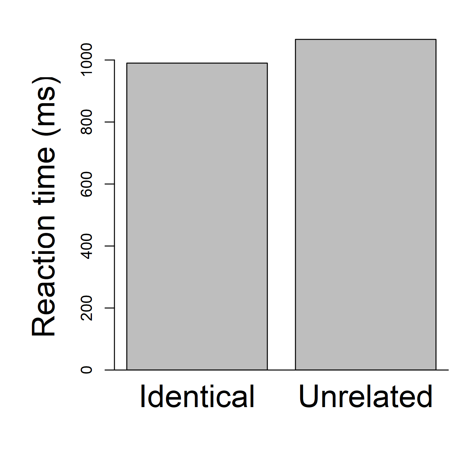
One easy way to look at this is to draw a graph. In most papers you've seen, it's common for authors to show a bar graph, where each bar is the average reaction time (across all participants) for one condition. (In some papers, such as the Zhou & Marslen-Wilson paper we discussed before, the authors might show a table, with that same information). So, for example, we could calculate that the average reaction time, across all participants, for the "Identical" condition is 990 milliseconds ( (854+1003+920+988+940+1028+992+1053+939+1183)/10 ). And the average reaction time for the "Unrelated condition" is 1066.5 milliseconds ( (969+1055+982+1071+1035+1053+1074+1115+1086+1225)/10 ). Then we might make a bar graph that looks like this:

(Note that I am making these graphs using R. It's also possible to make graphs in other software, such as Excel. Or you can even draw a graph by hand with paper and pencil. For this class I don't care how you create the graph, as long as you make a graph that's clear and accurate. Just do whatever is easiest for you, instead of spending too much time stressing out about trying to learn fancy software. If drawing a graph on paper and taking a photo of it is easy and efficient for you, that's fine for me.)
Here we can clearly see that identical trials are responded to, on average, faster than unrelated trials.
We don't see, however, whether that pattern is reliable across participants. Maybe every participant shows a pattern basically like this. Or maybe some participants show this pattern and some don't. Maybe there is even one participant for whom identical is much faster than unrelated, and 9 participants for whom identical is a little bit slower than unrelated!
To see whether the pattern varies across participants, I like to make a graph that shows every participant's data, rather than a bar graph that only shows the overall average. So, instead of (or in addition to) the bars, I like to draw lines that show each participant's results. For each participant, I can draw two dots (one for their "identical" reaction time, and one for their "unrelated" reaction time), and connect them with a line. In fact the dots may not even be necessary; to keep the graph from being too cluttered, I will draw it without the dots this time. I will get something looking like this:
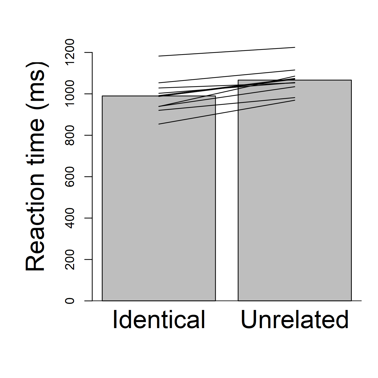
Beautiful, right? Now we can see the pattern for each participant. Importantly, we see that each participant's line is going up: in other words, each participant has a faster reaction time for "identical" than for "unrelated". What that means is that every participant has a priming effect.
There are many cosmetic changes that could be done to improve the graph and make things clearer. For example, the dark background on the bars isn't necessary; it's just clutter. I could make the y-axis start at about 800 ms, instead of 0 ms, so I could have a clearer and more detailed picture of the 800-1300 ms range where all the data actually are. Et cetera. But we can at least see the general principle: showing the individual participants' data in our graph gives us a clearer idea what's going on.
But this kind of graph isn't perfect. When we have a lot more data than just 10 people, it might be a little confusing. For example, this experiment actually had 152 participants, not just 10. (You can see a poster about the experiment here.) I only gave you 10 participants' data, to keep things simple. If I want to plot the results for all 152 participants, the graph looks a lot messier:
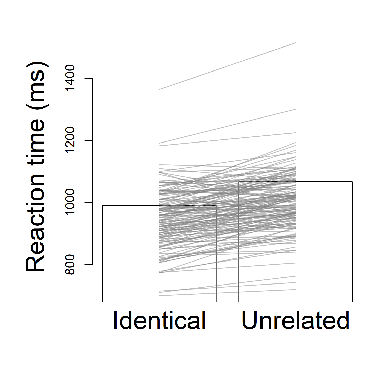
Now it's almost impossible to see the pattern. I already made some of the cosmetic changes I suggested: I "zoomed in" the graph to the appropriate range so I can see the lines more clearly, I took the background colour off the bars, and I even made the participant data lines semi-transparent so I can see them better (if they're solid black, lots of lines are covering each other up). Still, I can't see the general pattern easily; there are simply too many lines for my mind to keep track of all at once.
Generally what I want to know is, out of those participants, how many had a priming effect (i.e., how many were faster in the identical condition than the unrelated condition)? When we only had 10 subjects, that was pretty easy to do; we could just visually spot the upward-sloping lines, and count how many there are. With 152 participants, though, it's pretty hard to count that.
Things can get easier if we graph the priming effect for each participant, instead of the reaction times for each participant. Remember that the priming effect is the reaction time for the unrelated condition, minus the reaction time for the related condition. Look at the table of the first 10 participants again. What is the priming effect for each participant?
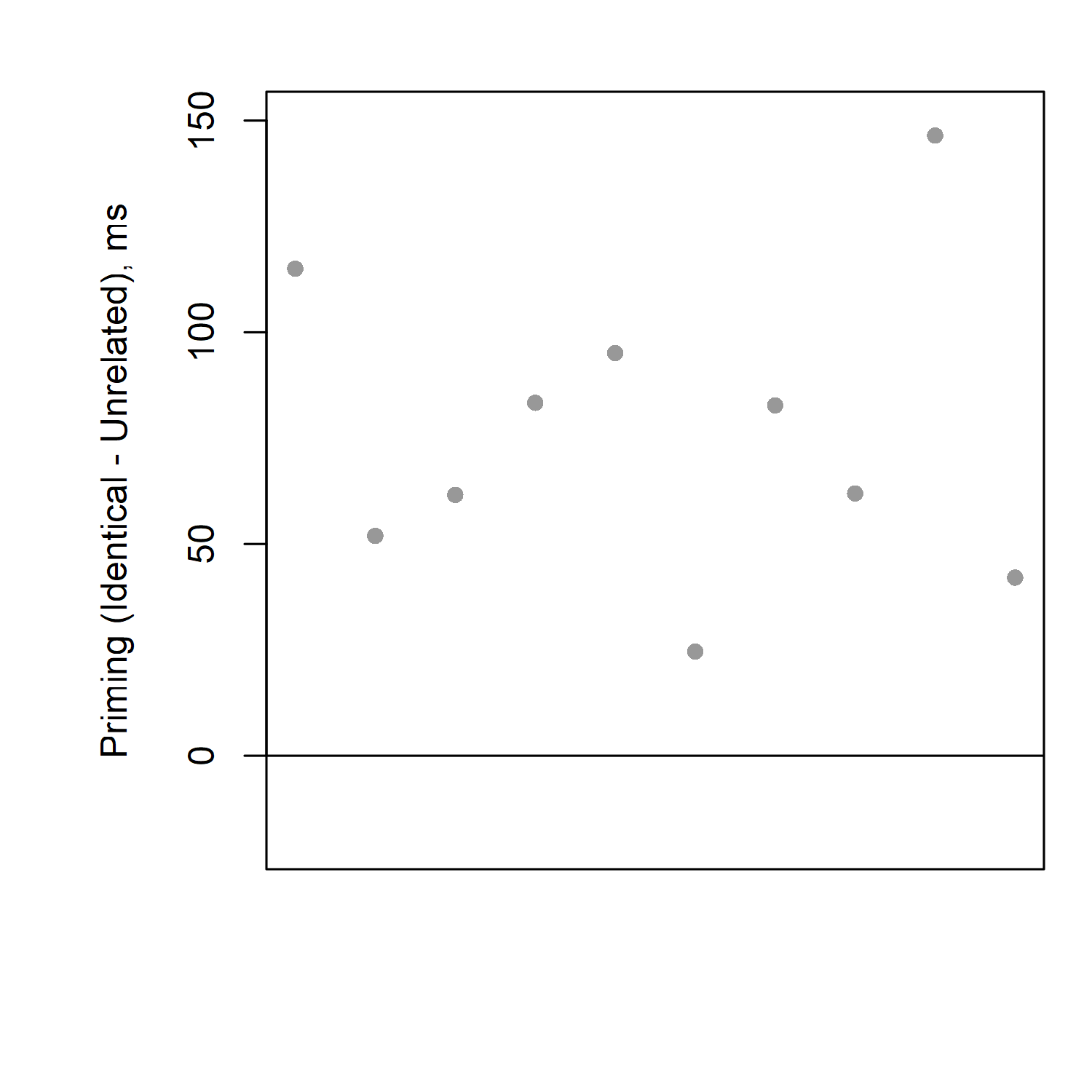
If you take the unrelated time minus the identical time, you should be able to calculate that the priming effects (differences) for each participant are, respectively: 115, 52, 62, 83, 95, 25, 82, 62, 147, and 42 milliseconds.
If we put these numbers into a graph, it's easy to see that everybody's priming effect is above zero; i.e., everyone is slower for unrelated than identical; i.e., everyone has a priming effect.
That was the graph for just 10 participants. What if we try this for all 152 participants? Here's what we get:
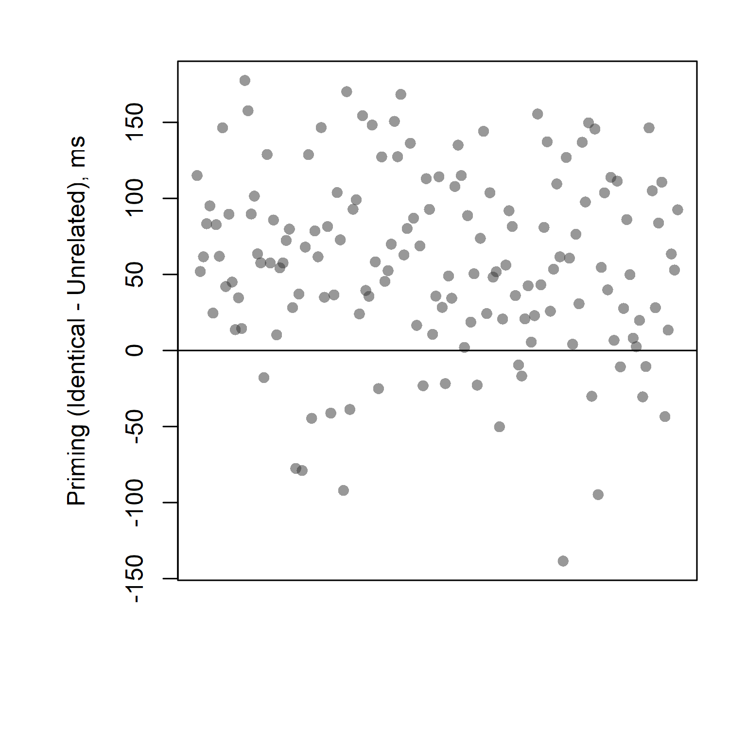
Here we can clearly see that the vast majority of participants have priming effects (differences above zero, meaning slower reaction times for unrelated than for identical). We can see that some participants, however, do have effects in the "wrong" direction (i.e., not the direction we would expect to see for a priming experiment). Out of 152 participants, fewer than 20 had "wrong" effects; more than 130 had effects in the direction we predicted.
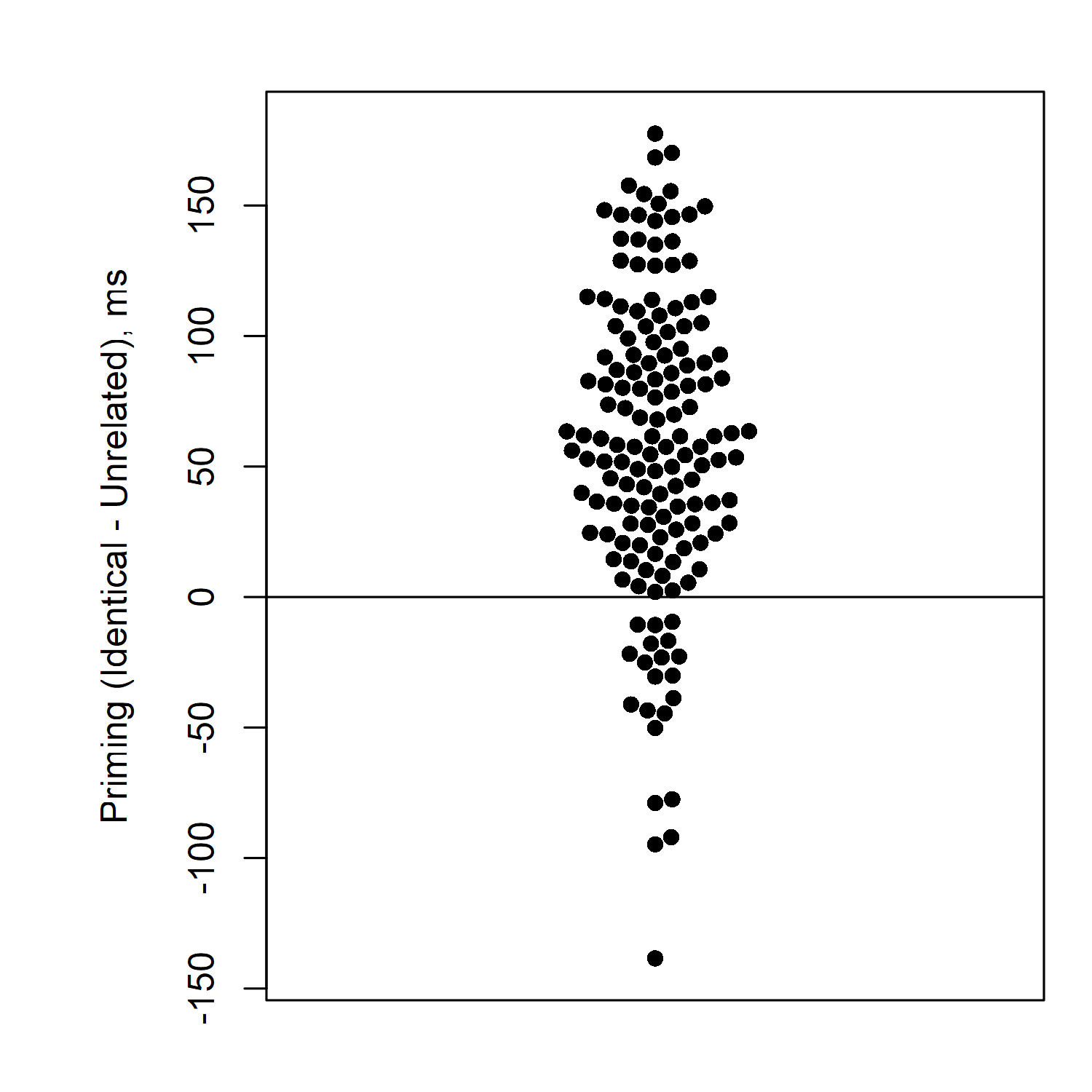
Here's one other way you can draw this graph. I like to arrange things in this way to make sure none of the participants' data points are overlapping. The other benefit of this is that you can look at the "widest" part of the distribution to see where most participants' priming effects are. The distribution is fattest around 50 milliseconds, meaning that the most common priming effect size in this experiment is about 50 milliseconds. (I make this kind of graph in R, using a package called "beeswarm". It would also be easy to make by hand if you draw one dot at a time. It's not so straightforward to make in Excel—it's possible, but would require many steps, or a special template.)
Why is it important to look at the patterns for each participant? For some comparison, let's look at another dataset. Here priming data from 100 participants in a different priming experiment: priming.csv
What are the average reaction times for unrelated and related? Try to calculate them on your own before continuing on to see the answer...
.
.
.
.
.
.
.
The average reaction time for related is 1212 milliseconds, and the average for unrelated is 1321 milliseconds. That looks like a big priming effect—related is more than 100 ms faster than unrelated!
But how do things look if we check out the pattern for each individual participant?
Try examining this yourself, before you scroll down to see my graph...
.
.
.
.
.
.
.
.
.
Here's my graph of the priming effects for the individual participants:
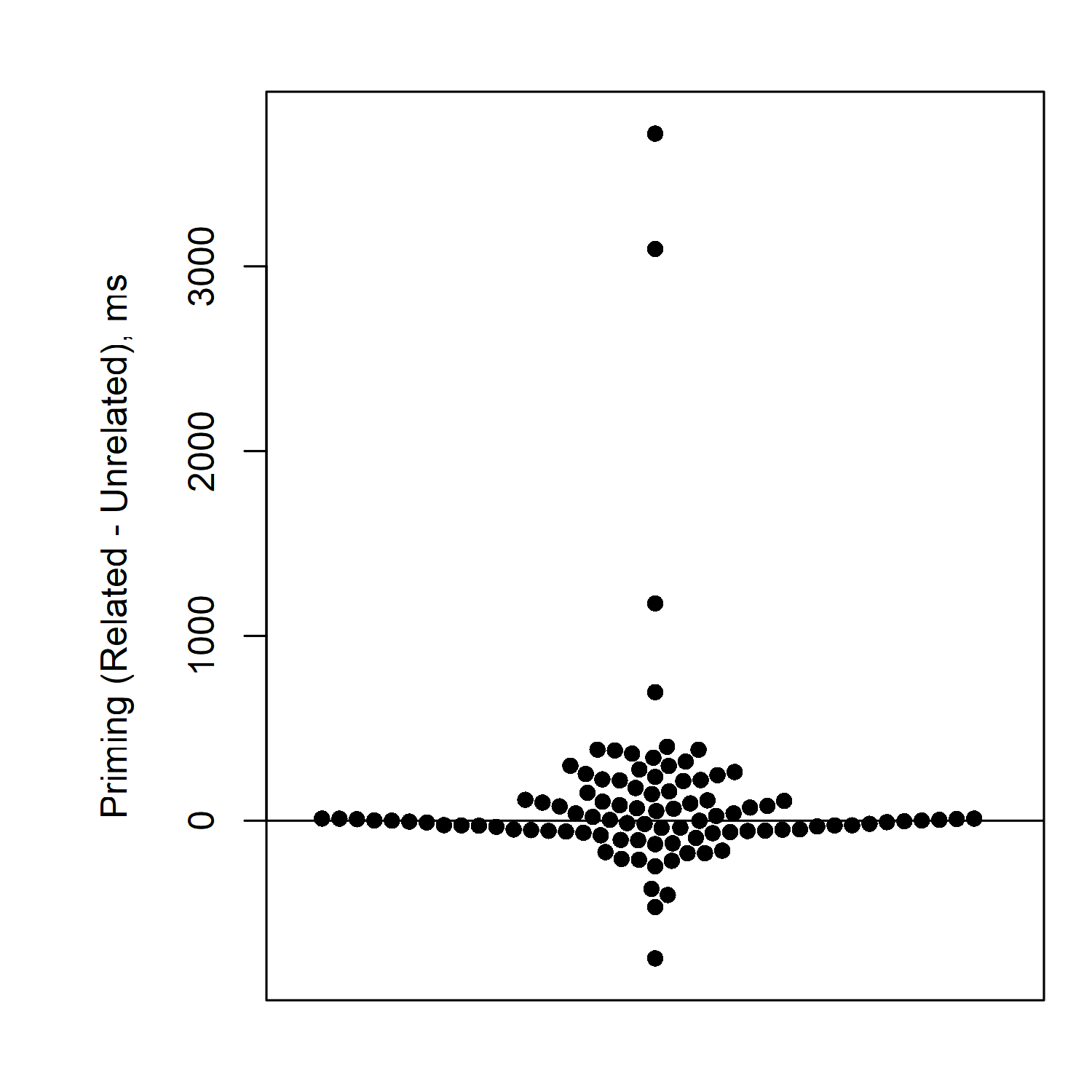
Here we see that actually the vast majority of participants have no priming effect, or very little priming effect. Some are even below zero. And a few unusual participants (just 4 out of 100) have huge priming effects.
So actually, the 100-ms priming effect we saw in the average, does not really reflect most participants. There are just 4 extreme participants who are pulling up the average very high.
In this case, it would probably not be appropriate to conclude that we found a robust priming effect in the experiment. Actually most of our participants had no priming effect at all.
Drawing clear graphs like this is a huge help when you need to make a conclusion about your data. There are no hard-and-fast rules for what conclusion to make; you have to use your judgment. But these kinds of graphs can help you make that judgment. Sometimes there will be pretty clear cases, where your graph shows that the same pattern was present in most participants (or even all participants; see this paper for results in which literally every participant shows the expected difference between "audio" and "incongruent). Sometimes it will be very clear that almost no participants show the pattern, such as in the example we just saw. Sometimes the data are scattered around such that there is no clear pattern (e.g., maybe about half of the participants are above zero and about half are below). When the pattern is unclear that's also useful to know; it lets you know that your conclusion should not be very extreme.
For more information on making effective graphs, see the following papers:
You don't need to submit anything to me for this section. I just want you to make sure you are familiar with how to make conclusions, before you go on to analyzing your real experiment data. When you feel comfortable with the concepts from this activity, you may move on to the next task: "Do the experiment!".
by Stephen Politzer-Ahles. Last modified on 2021-07-12. CC-BY-4.0.