CIpirateplot()
pirateplot(),
by Nathaniel Phillips, is an excellent function that creates plots which combine a bar plot, a violin plot (beanplot), and a univariate scatter plot.
The resulting plots show both group means (like a barplot or point plot would) and a visual representation of the data distribution (like a
histogram, violin plot, or scatter plot would). As such, they are a great alternative to bar plots (see, e.g.,
Page Piccinini's post describing problems with barplots).
However, one reason I have traditionally used barplots is because, as someone whose research hypotheses are usually about
mean differences, I usually want to be able to plot 95% confidence intervals that will help readers make quick-and-dirty inferences
about comparisons between various means. Adding such intervals as error bars on a bar plot or point plot is straightforward. The pirate
plot, unfortunately, doesn't have a built-in way to add error bars, and indeed I suspect that manually adding error bars on top of all
its other stuff would look quite messy. (Plus, putting error bars onto a bar plot is easy because the barplot() function
returns a list of x-axis values of the midpoints of the bars, which is helpful for figuring out where to plot the error bars;
pirateplot() does not do this, although this might not be a big issue, because there might be other simple ways to place
the error bars.)
The function described below is a modification of the original pirateplot() function to plot confidence
intervals. pirateplot() can plot a shaded interval representing the Bayesian 95% highest density interval. Since I don't
usually need to plot that, I have adapted the code to use that shaded interval to plot confidence intervals instead. Examples and usage
notes are given below.
Usage requirements. The function (along with some other functions, including a function for Cousineau-Morey
confidence intervals that this function uses) is available at http://www.polyu.edu.hk/cbs/sjpolit/Steve_functions.txt.
The easiest way to get access is to run source( url( "http://www.polyu.edu.hk/cbs/sjpolit/Steve_functions.txt" ) ) during your R
session. The package "yarrr" must be installed (see the documentation for the original
pirateplot(), linked above, for instructions how). Like in a usual barplot, you can only plot two factors at once;
to plot more factors (e.g., to plot a three-way interaction) you need multiple plots arranged together.
Options. Most of the options are the same as for the original pirateplot(), described
here. However, there are
some special options specifically related to the handling of confidence intervals.
- conf.level: The confidence level (as a proportion, not a percentage) to use for the CI. Defaults to .95.
- CI.type: either
"between" (the default) or "within"; specifies whether to plot a between-groups (standard)
CI, or a within-groups (i.e., within-subjects) CI. For within-groups CIs, it plots a Cousineau-Morey confidence interval. Note that a
within CI is only meaningful if grouping.var (see below) is specified.
- grouping.var: Specifies the name (i.e., the column of of the data frame) of the variable over which repeated measures were done. For example, when plotting
a within-subjects CI, there will have been repeated measures over subjects. Even for plotting standard between-subject confidence intervals,
however, it is important to specify this grouping variable, in order to ensure that the function aggregates over observations within
a given subject (or whatever the grouping variable is). This is because a between-subject CI for a given condition in a repeated measures design is typically
based on the SD of the subject means, not the SD of all the observations.
- make.legend: a boolean variable specifying whether to plot a legend or not plot one (the default).
Examples. And now the good stuff:
# Load the function
source( url( "http://www.polyu.edu.hk/cbs/sjpolit/Steve_functions.txt" ) )

### A pirate plot for non-repeated-measures data
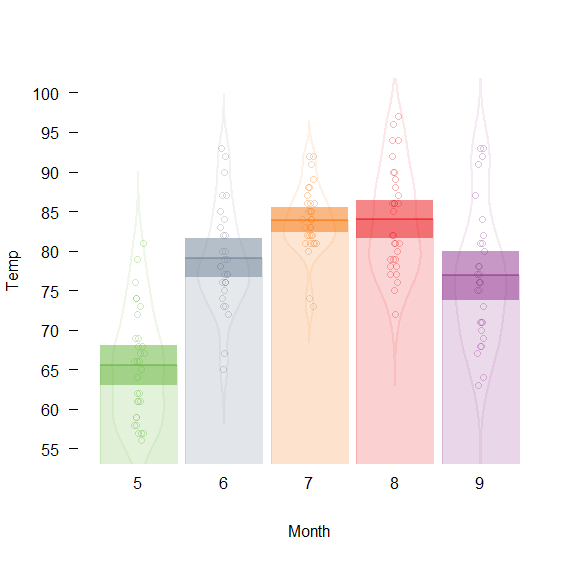
airquality$Month <- factor( airquality$Month )
CIpirateplot( Temp~Month, airquality, ci.o=.5, bar.o=.2 )
## Warning: closing unused connection 5 (http://www.mypolyuweb.hk/~sjpolit/
## Steve_functions.txt)
### A repeated-measures, fully within-subjects design, with within-subject CIs
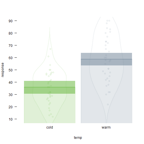
library(ordinal)
CIpirateplot( response~temp, wine, grouping.var="judge", CI.type="within", ci.o=.5, bar.o=.2 )
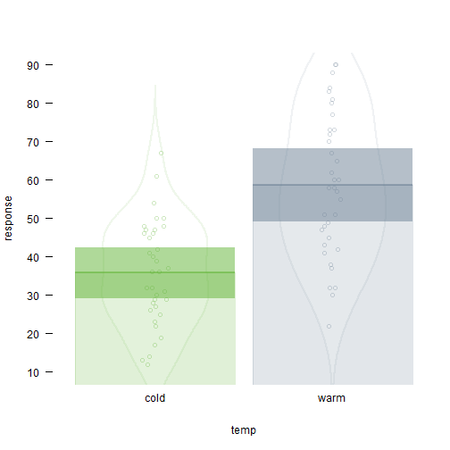
# what that would have looked like if we used between-subject CIs
CIpirateplot( response~temp, wine, grouping.var="judge", CI.type="between", ci.o=.5, bar.o=.2 )
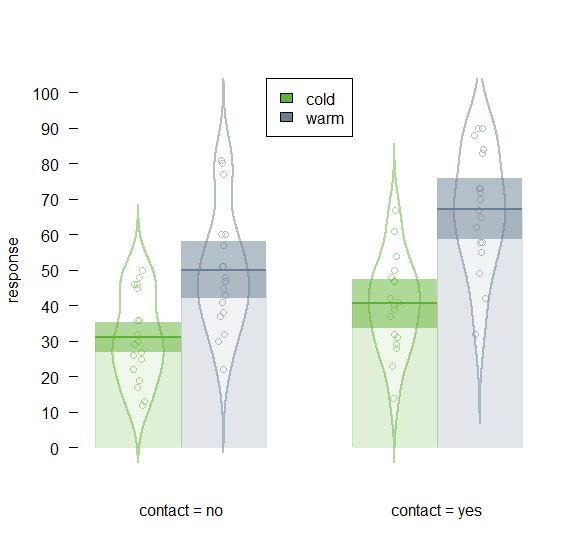
# Plot for a factorial within-subject design, and with a legend
CIpirateplot( response~temp+contact, wine, grouping.var="judge", CI.type="within", ci.o=.5, bar.o=.2, make.legend=T )
### A pirate plot for a design with repeated-measures data but between-subject conditions,
###	such that we want between-subject CIs but we still need to specify a grouping.var
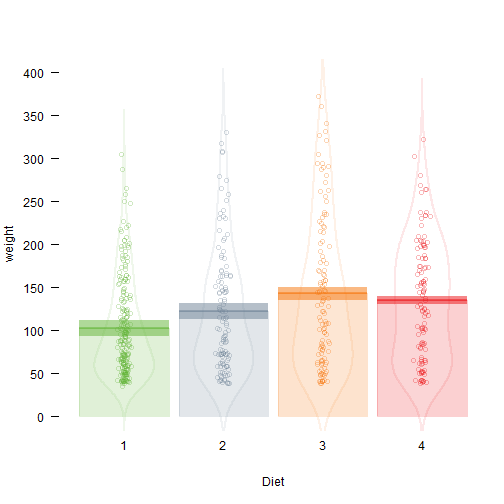
CIpirateplot( weight~Diet, ChickWeight, grouping.var="Chick", CI.type="between", ci.o=.5, bar.o=.2 )
by Stephen Politzer-Ahles. Last modified on 2016-05-25.
